
BRINGING HN01 TO LIFE
The Havid Nagan design language communicated across the HN00’s characteristics serve as the introduction to the brand’s overall identity. The cushion case architecture is an aspect I spent a considerable amount of time on with three constant parameters– 1, it must be the truest form of my vision for the perfect watch, 2, it must be distinct and nuanced to distinguish itself from all else, and 3, it must be supremely ergonomic and comfortable. I am ecstatic that we’ve begun the deliveries of the -00’s and cannot wait for all those that ordered to finally experience them!
As we all await the deliveries, I find myself in a similar yet separate consideration in designing the HN01. While 95% of the case geometry will remain constant, the watch will be significantly thinner (~1.4mm reduction on thickness while adding complication) and additional polished flanks are being tested to add even more dimensionality. The goal is to constantly audit and push the design towards its inevitable and natural evolution. As previously mentioned, the case design for Havid Nagan was inspired more by architecture than any sort of historical context in watch case design. As is the reality we spend a considerable amount of our lives in our respective homes, for us ‘inflicted’ individuals, our wrists are rarely left unaccompanied by a watch. It was a natural inspiration for me and my background and one that continues to serve as such in my day-to-day observations.

Spec rendering

Spec rendering

Spec rendering
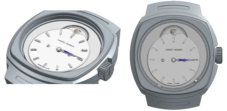
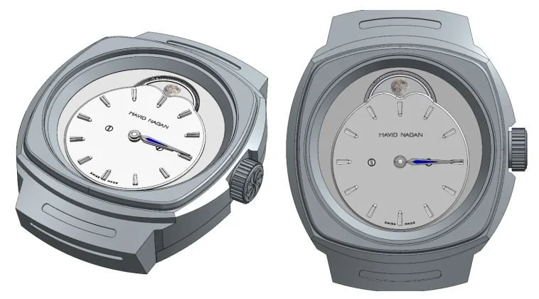
A FRESH FACE
The dial is where the collector will see the biggest difference between -00 and -01. Lucine will present a significant change in terms of 1, what will be seen when viewing the watch and 2, the design language the brand will be associated with going forward. Off-centering complications has always been an adoration of mine and every single Havid Nagan model will feature off-center indications moving forward. Another characteristic the new design language will introduce is dimensionality, specifically on the periphery surrounding the dial. The sub-dial displaying time will appear as if it is floating above the mainplate of the movement, which itself will be decorated in NAC treatment and perlage. The idea for this was to create a structure within a structure. The above referenced images are, of course, spec renderings as details will change for the dial details and layout. The clash between the indices, moon phase mounds, and minutes track can be observed, which ultimately lead me to remove the minutes track entirely.
Technical details are what consume my every conscious, sub-conscious, and at times, unconscious thoughts. The development process is essentially a volley back and forth between myself and my manufacturing partners, in this case, Chronode, Schwarz-Etienne, and Cadranor. I’d like to outline an instance in which the technical limitations, or more appropriately, technical definitions directly influence the aesthetic details of the watch. The first image referenced below to the left depicts the movement and dial placed into the Lucine case and allows for the viewer to see a gap between the movement outer diameter and the interior of the case, essentially a useless empty space that breaks the overall design of what the wearer will see and experience. What is being considered now is an extension of the inner bezel to cover the gap to make the design more cohesive and true to my vision from the start.
Original technical drawing
After modification of bezel
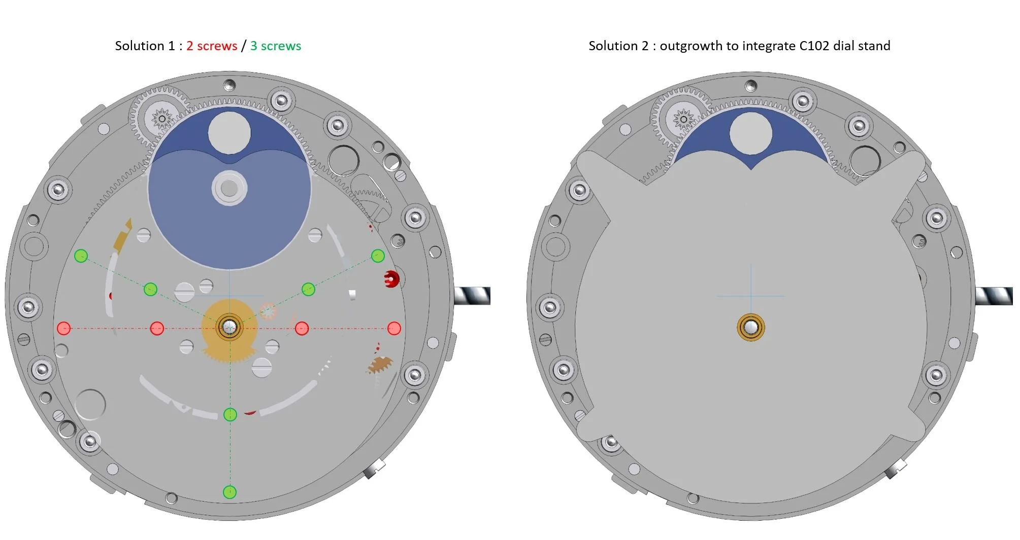
Another point I’d like to make, and one you’ve undoubtedly noticed, are the two screws on the dial. Typically in dial construction, you have what are referred to as “dial feet”, or metal rods protruding out from the rear of the dial, that directly line up and attach to matching slots on the mainplate of the movement. This is how dials are secured to the movement. For Lucine and it’s off-center dial, the typical construction doesn’t apply as the dial’s diameter doesn’t reach the periphery of the movement. So, I was left with considering 1, the shape of the dial and 2, the placement of the screws. The Solution 2 option referenced below left, the dial itself is pulled from 4 corners to maintain the typical dial feet placement, which for me was a non-option as it is not aesthetically pleasing and destroys the overall design of the watch. Solution 1 was the obvious choice and I chose the screw positions directly to the sides of the hours/minutes slot. These screws will be polished, of course - considering the dial’s finish will be matted with a sort of slight glimmer effect - providing a contrast between the different finishes.

The Mystery Moon

Anterior view of Lucine’s moonphase disc

Lateral view of Lucine’s moonphase disc
A particular and unique execution of the moonphase for Lucine was a requirement when I set out to brief the manufacturing partners for 2 reasons - 1, it is no surprise that the moonphase complication is only a romantic curiosity nowadayas, rather a utility in itself and 2, to further the idea that pragmatism is being relinquished, then an idealistic, or in this case a unique, execution of the moonphase depiction must be made.
With Lucine, I am executing this on two fronts - aesthetically and technically. The actual depiction and coloring of the moonphase you will see is an official license of Havid Nagan and is/will be unique to my watches exclusively. It is the result of an astrophotographer’s capture of multiple composite layers of photography of our moon, in which the varying mineral deposits are made apparent. The photo was captured from the Northern Hemisphere from Las Vegas, Nevada.
The technical execution of the moonphase is also proprietary made only possible by the genius minds of Chronode’s Jean-Francois Mojon and his brilliant team. Typically, any moonphase disc has ‘arms’ running underneath the disc from moon-to-moon, which is why most phase discs will be colored to hide the arms. Lucine’s disc is made of sapphire and the arms underneath have been removed, so the wearer of the watch will only see the moon coming and going in it’s phases. We have unofficially dubbed this the ‘mytery moonphase’. The accuracy of the phase will be a rate of one day error every 11.6 years, a result of inserting an additional mobile wheel which increases the ratio between the respective driving wheels.
I hope to have more information on HN01 Lucine as we progress through the technical development of the watch with hopes of the prototypes being in my hands by late-July 2023. Lucine will be a milestone in Havid Nagan’s history and accomplish many goals simultaneously. I, along with my manufacturing partners are working as quickly and thoroughly as possible so as always, I thank all collectors and enthusiasts for their incredible patience.
Talk soon,
Aren J BAZERKANIAN